12 Homepage Design Tips You Must Know
Knowing how to improve your website homepage design is critical for impressing leads, users, and customers. Learn how to do it right with SITE123 today!
Your homepage creates the first impression of your brand and business, so there are several things that you may want to consider first before you create your vision board.While many things need to make it onto your checklist, we sifted through some homepage website design tips to bring you 12 ideas you cannot do without.
Table of Contents:
First Impressions Last
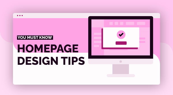
Of course, graphics and slick imaging are important. But so is text and copy. Both are extremely vital when planning the header on your homepage.Visuals must correlate your objectives, or at least who you are as a brand or business. Web copy should do the same thing without being stuffy, cluttered, and overwhelming.
Your ability in doing so will help your page visitors differentiate you from competitors and help them remember you.

Call-To-Action Above The Fold
Ok, technically this is not necessary, but this is a practice that seems to work in most cases and wastes no time. An effective call to action makes a huge difference.Not everyone is ready for purchase as they land on your site, but there will be instances when there are visitors who are ready. Using a CTA creates a sense of urgency that may cause people to purchase from you sooner.
What may help is to incorporate a CTA in your navigation to help you be the early bird that catches the worm. Action verbs are best, and looking up a list of effective verbs is a great way to begin choosing your CTA. Make sure to use action words when designing your CTA.
Mobile Compatibility
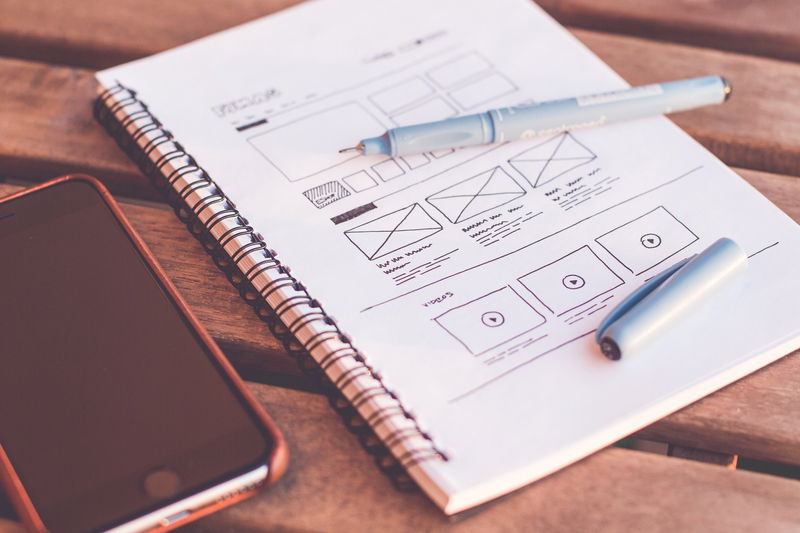
Not having mobile optimization set in place is a shot in the foot. It’s an unavoidable necessity, and while some mobile versions of websites don’t look that good, a seamless user experience will help in this regard, since most web traffic comes from mobile devices.You may want to ensure that your website homepage design looks exactly how you want it on different mobile screens before you agree to a new layout.
Building a website with SITE123 is easy

Use Directional Cues
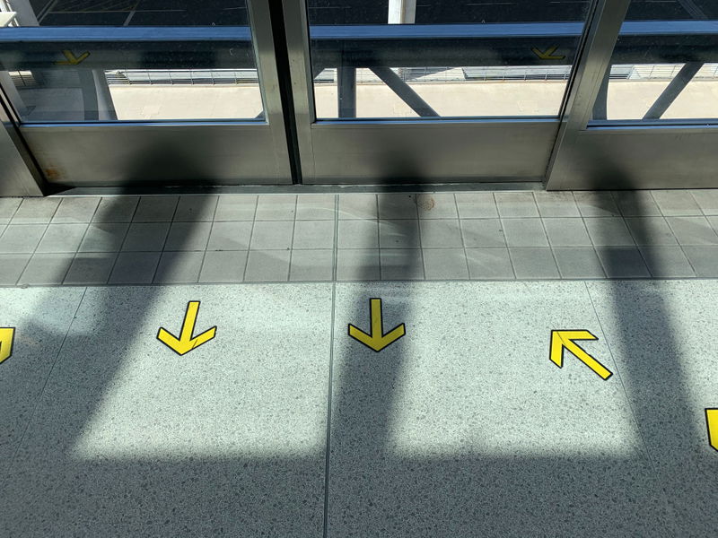
Directional cues include arrows (or any other shapes) and people pointing or looking in a specific direction.These cues will help with the flow from one section to another on your homepage where it is needed.
This is a clever method that heightens the user experience of your page and helps guide visitors from viewing to purchasing a product or making use of your services.
Consider Whitespace
Clutter is painful on a website, and so is excessive use of color. Thousands of homepages stick to a slick approach in design and layout by avoiding clutter.Web designers and business owners have come to understand that the effects that whitespace has on user-friendly design and the overall seamlessness and focus that comes with it to help increase conversions.

Make Use Of Video Content
Endless strings of text will not do much for your homepage design. Video packs a punch and is one of the most powerful additions to your homepage design.A short animated video explaining your service or product is all you need. Having it be well-produced is worth the time and adds that special touch to your homepage.
As your business grows, you may invest more in longer videos that share testimonials or provide more insight about what you do.

Elicit Emotions
Colors have an emotional appeal and will elicit certain feelings. Bright colors imply a cheerful and more lighthearted feeling, while dark colors are more serious. Choosing the right set of colors for your homepage should not only match your branding, but also the emotions you wish to elicit or link with your business.
List Your Clients By Logo
Featured logos of your clients are like trust seals that showcase your previous contracts, but they also serve as an element showing your visitors that your company is legit and trustworthy.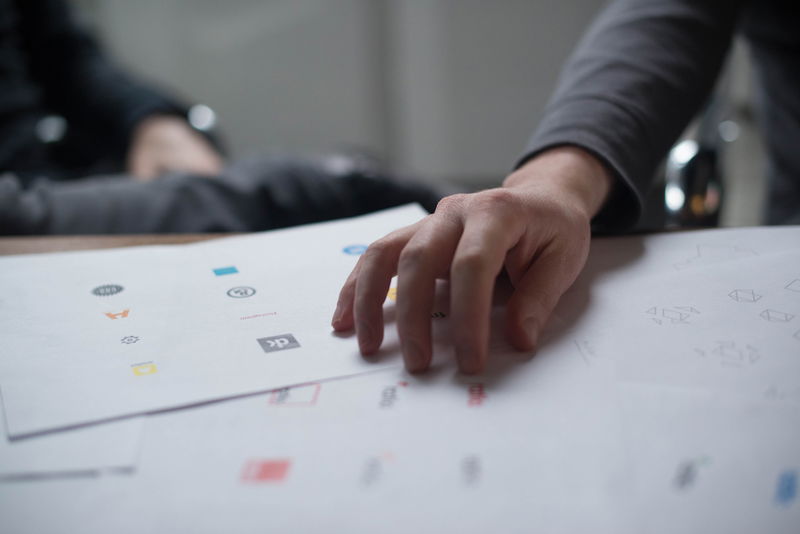
Strive For Structure
An off-balance layout, cluttered text, excessive use of imaging, and GIFs creates a negative user experience. The human eye requires structure to make sense of what it’s about to absorb and an awkward appearance minimizes your brand’s value. Use powerful website images sparingly to catch people’s attention.
Add Social Share And Follow Buttons
Having a great website is one thing and so are the offers that your business will provide visitors, but if they are not able to share what you have across multiple platforms, this raises a cause for concern.Not only is a social media presence vital, but if your site lacks social share buttons, you could be missing out on traffic that comes from your site.
These buttons act as a subtle tool that encourages sharing from your buyer personas and are an important part of any marketing campaign.

Implement SEO
A substantial online presence needs a website that can be found online. Your SEO strategy must be developed to take into consideration the search terms your buyer personas and audience would search for.There are endless possibilities that you could rank for, but you may want to avoid focusing on it too much.
If you can highlight the keywords that apply to your buyer personas and audience, it will help you attract visitors that may have never come across your product or business organically.
Always Update
After a while, your homepage design will become stale. Trends change and they change fast - no matter how great you may think it still looks. This applies to the usability of your site too. You want your website to be beautifully designed in the modern style to keep user attention.Implement small changes and improvements every few months to keep your homepage relevant.


