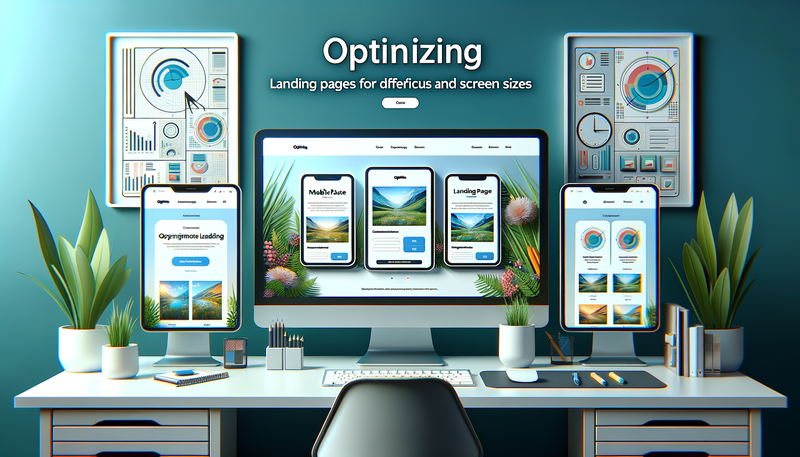
Optimizing Landing Pages for Different Devices and Screen Sizes
In today's multi-device world, optimizing landing pages for different screen sizes is crucial for maximizing conversions and user engagement. This article explores effective techniques for creating responsive landing pages that deliver exceptional performance across desktop, tablet, and mobile devices. We'll delve into adaptive design strategies, content prioritization methods, and device-specific features that can enhance the user experience. By implementing these optimization techniques, you'll be able to create landing pages that not only look great on any device but also drive better results for your business. Whether you're a seasoned web designer or just starting out, this guide will provide valuable insights to help you craft landing pages that adapt seamlessly to various screen sizes and user preferences.Table of Contents:
Understanding Responsive Design
Responsive design is the foundation of creating landing pages that work well across different devices. This approach involves using flexible grids, layouts, and images that automatically adjust to fit the screen size of the device being used. By implementing responsive design techniques, you ensure that your landing page looks and functions optimally on desktops, tablets, and smartphones alike.Key elements of responsive design include fluid grids, flexible images, and CSS media queries. Fluid grids use relative units like percentages instead of fixed units like pixels, allowing content to resize proportionally. Flexible images adapt to different screen sizes without losing quality or breaking the layout. CSS media queries enable you to apply different styles based on the device's characteristics, such as screen width, height, or orientation.
Do you need a website? Want to build a website but don't know where to start? Our website builder is the perfect solution. Easy to use, and with the ability to customize to fit your business needs, you can have a professional website in no time.
Implementing Adaptive Design Strategies
While responsive design provides a solid foundation, adaptive design takes optimization a step further by tailoring the user experience to specific devices. Adaptive design involves creating multiple layouts for different screen sizes and serving the most appropriate version based on the user's device.To implement adaptive design, start by identifying the most common screen sizes used by your target audience. Create separate layouts for these breakpoints, focusing on optimizing the content and functionality for each device type. This approach allows you to fine-tune the user experience for different devices, potentially leading to higher engagement and conversion rates.
Consider using server-side detection to serve device-specific content, which can improve page load times and overall performance. This technique involves detecting the user's device on the server and delivering the most suitable version of the page, reducing the amount of unnecessary code and resources sent to the client.
Prioritizing Content for Different Devices
Content prioritization is crucial when optimizing landing pages for various screen sizes. As screen real estate becomes limited on smaller devices, it's essential to present the most important information first and streamline the overall content.Start by identifying the core message and primary call-to-action (CTA) of your landing page. Ensure that these elements are prominently displayed across all devices. For mobile devices, consider using a single-column layout to simplify navigation and reduce clutter.
Use progressive disclosure techniques to reveal additional information as users scroll or interact with the page. This approach helps maintain a clean, focused design while still providing access to all necessary information. Consider using expandable sections or accordion menus to organize secondary content on smaller screens, allowing users to access details without overwhelming the initial view.
Building a website with SITE123 is easy
Optimizing Images and Media
Images and media play a crucial role in landing page design, but they can also significantly impact page load times and performance, especially on mobile devices. To optimize images for different screen sizes, use responsive image techniques such as the srcset attribute or picture element in HTML.These methods allow you to provide multiple versions of an image at different resolutions, enabling browsers to choose the most appropriate version based on the device's screen size and pixel density. This approach ensures that users receive appropriately sized images, improving both load times and visual quality.
For video content, consider using adaptive streaming technologies that adjust video quality based on the user's connection speed and device capabilities. This ensures a smooth playback experience across various devices and network conditions. Additionally, use lazy loading techniques to defer the loading of off-screen images and media, further improving initial page load times.
Leveraging Device-Specific Features
Take advantage of device-specific features to enhance the user experience on different platforms. For mobile devices, consider implementing touch-friendly elements such as swipe gestures for image galleries or tap-to-call functionality for phone numbers.On tablets and desktops, utilize hover effects and larger click areas to improve interactivity. Incorporate keyboard navigation and accessibility features to ensure a seamless experience for users who rely on assistive technologies.
For location-based services or apps, leverage GPS capabilities on mobile devices to provide personalized content or streamline user inputs. On desktop devices, take advantage of larger screens to display more detailed information or advanced features that may not be suitable for smaller screens.
Testing and Optimization
Thorough testing is essential to ensure your landing pages perform well across different devices and screen sizes. Use browser developer tools and dedicated mobile testing platforms to preview and debug your pages on various devices and screen resolutions.Conduct user testing on different devices to gather feedback on the user experience and identify any usability issues. Pay attention to factors such as readability, touch target sizes, and overall navigation flow.
Utilize analytics tools to track user behavior and conversion rates across different devices. This data can help you identify areas for improvement and guide future optimization efforts. Continuously monitor and refine your landing pages based on user feedback and performance metrics to ensure they remain effective across all devices.


