The Art of Creating Effective Infographics for the Web
In the digital age, infographics have become a powerful tool for conveying complex information in a visually appealing and easily digestible format. This article explores the art of creating effective infographics for the web, delving into best practices for design, data visualization techniques, color usage, and layout strategies. Whether you're a marketer, educator, or content creator, mastering the craft of infographic design can significantly enhance your ability to communicate ideas and engage your audience. We'll examine key principles and provide practical tips to help you create compelling, shareable infographics that stand out in the crowded online landscape.Table of Contents:
-
Understanding the Power of Infographics
- Defining Your Infographic's Purpose and Audience
- Crafting a Compelling Narrative
- Choosing the Right Data Visualization Techniques
- Employing Effective Color Strategies
- Optimizing Layout and Typography
- Incorporating Engaging Visual Elements
- Ensuring Responsiveness and Web Optimization
- Promoting Shareability and Virality

Understanding the Power of Infographics
Infographics have gained immense popularity due to their ability to present complex data and concepts in a visually appealing manner. They combine text, images, and data visualizations to tell a story or explain a topic concisely. The human brain processes visual information much faster than text alone, making infographics an ideal medium for capturing attention and conveying information quickly. When designed effectively, infographics can increase engagement, improve information retention, and encourage social sharing. This makes them invaluable for businesses, educators, and content creators looking to make an impact in the digital space. Do you need a website? Want to build a website but don't know where to start? Our website builder is the perfect solution. Easy to use, and with the ability to customize to fit your business needs, you can have a professional website in no time.
Defining Your Infographic's Purpose and Audience
Before diving into design, it's crucial to clearly define the purpose of your infographic and identify your target audience. Ask yourself: What key message do you want to convey? Who is your intended audience, and what information will be most valuable to them? Understanding these factors will guide your content selection, design choices, and overall approach. For example, an infographic aimed at business professionals might focus on data-driven insights with a more formal design, while one targeting a younger audience might use more casual language and vibrant colors. Tailoring your infographic to your specific audience ensures that your message resonates and achieves its intended impact.Crafting a Compelling Narrative
Effective infographics tell a story or guide the viewer through a logical sequence of information. Start by outlining the key points you want to communicate and organize them in a coherent flow. Use a clear hierarchy to lead the viewer's eye through the content, from the most important information to supporting details. Consider using a central theme or metaphor to tie the various elements together and make the information more relatable. For example, if you're explaining a business process, you might use a road trip analogy, with each step represented as a destination along the journey.Remember to keep the content concise and focused. Avoid cluttering the infographic with unnecessary information that could distract from your main message.
Building a website with SITE123 is easy
Choosing the Right Data Visualization Techniques
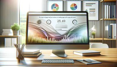
Data visualization is at the heart of many infographics. Selecting the appropriate charts, graphs, or diagrams is crucial for effectively communicating your data. Bar charts are excellent for comparing quantities across categories, while line graphs are ideal for showing trends over time. Pie charts work well for displaying proportions of a whole, but should be used sparingly and with a limited number of segments. For more complex data sets, consider using treemaps, bubble charts, or interactive visualizations.Whichever type you choose, ensure that the visualization accurately represents the data and is easy to understand at a glance. Avoid 3D effects or overly complex designs that can distort the data or confuse the viewer. Always prioritize clarity and accuracy over flashy visual effects.
Employing Effective Color Strategies
Color plays a crucial role in infographic design, influencing mood, guiding attention, and enhancing comprehension. Choose a color palette that aligns with your brand or topic, ensuring sufficient contrast for readability. Use color consistently to represent categories or highlight important information. For data visualizations, select colors that are easily distinguishable from one another, especially when representing different categories.Be mindful of color psychology and cultural associations. For example, red often signifies urgency or danger in Western cultures, while green is associated with growth or environmental themes. Limit your palette to 3-5 main colors to maintain a cohesive look. For accessibility, ensure that your color choices work well for colorblind viewers by using tools that simulate different types of color blindness.
Optimizing Layout and Typography
A well-structured layout is essential for guiding viewers through your infographic. Use a grid system to align elements and create a sense of order. Establish a clear visual hierarchy by varying the size and weight of text elements. Headers should be prominently displayed, with subheaders and body text in decreasing sizes. Choose fonts that are easily readable on screen, typically sans-serif fonts for body text and possibly serif fonts for headers to add visual interest.Maintain consistent spacing between elements and use white space effectively to prevent the design from feeling cluttered. Group related information together and use visual cues like lines, shapes, or icons to delineate different sections. Remember that viewers typically scan content in an F or Z pattern, so position your most important information along these natural eye paths.
Incorporating Engaging Visual Elements
While data visualizations are often the focus, other visual elements can enhance the appeal and effectiveness of your infographic. Use high-quality, relevant images or illustrations to support your content and make it more memorable. Icons can serve as visual shortcuts, quickly conveying ideas without the need for lengthy explanations. Consider using custom illustrations or infographic-specific graphics to give your design a unique feel.Animated elements or interactive features can add an extra layer of engagement, but use them judiciously to avoid overwhelming the viewer or slowing down page load times. Always ensure that any visual elements you include serve a purpose and contribute to the overall message of your infographic.
Ensuring Responsiveness and Web Optimization
In today's mobile-first world, it's crucial to design infographics that display well on all devices. Consider creating multiple versions of your infographic optimized for different screen sizes. For complex infographics, you might design a simplified mobile version that focuses on key takeaways. Use vector graphics where possible to ensure sharp rendering at any size.Optimize your infographic for web performance by compressing images and using appropriate file formats (e.g., PNG for graphics with transparency, JPEG for photographs). If using interactive elements, ensure they're built with mobile touch interfaces in mind. Additionally, provide alt text for all images to improve accessibility and SEO. Consider creating a text-based version of the infographic content for screen readers and search engines.
Promoting Shareability and Virality
To maximize the impact of your infographic, design with shareability in mind. Include your logo or website URL subtly within the design to ensure proper attribution as it's shared across platforms. Create multiple versions optimized for different social media platforms, considering their specific image size requirements and user behaviors.Craft a compelling title and description to accompany your infographic when shared. Encourage sharing by including social media buttons or embed codes on the page where the infographic is hosted. Consider reaching out to influencers or industry publications that might be interested in sharing your infographic with their audiences. Track the performance of your infographic using analytics tools to understand what resonates with your audience and inform future designs.