The Impact of Nostalgia in Web Design
Nostalgia in web design has become a powerful tool for creating emotional connections with users. By incorporating elements from the past, designers can evoke feelings of comfort, familiarity, and warmth. This article explores the impact of nostalgic design elements in modern web design, focusing on retro color palettes, vintage typography, and other techniques that tap into users' memories and emotions. We'll delve into how these elements can be effectively integrated into contemporary websites, striking a balance between old-school charm and modern functionality. Understanding the psychology behind nostalgia and its application in web design can help create more engaging and memorable user experiences.Table of Contents:
-
The Psychology of Nostalgia in Design
- Retro Color Palettes: A Trip Down Memory Lane
- Vintage Typography: Fonts That Tell a Story
- Skeuomorphic Design Elements: Bridging the Digital and Physical
- Retro Imagery and Icons: Visual Time Capsules
- Micro-interactions and Animations: Nostalgic Delights
- Balancing Nostalgia with Modern Usability
The Psychology of Nostalgia in Design
Nostalgia is a powerful emotion that can transport us back to cherished moments and experiences. In web design, tapping into this sentiment can create a strong emotional connection with users. Research has shown that nostalgia can evoke positive feelings, increase social connectedness, and even boost mood.By incorporating nostalgic elements into web design, businesses can leverage these psychological effects to create more engaging and memorable user experiences. This emotional resonance can lead to increased user satisfaction, longer site visits, and improved brand loyalty. Understanding the psychological impact of nostalgia is crucial for designers looking to create websites that not only look good but also feel good to interact with.
Do you need a website? Want to build a website but don't know where to start? Our website builder is the perfect solution. Easy to use, and with the ability to customize to fit your business needs, you can have a professional website in no time.
Retro Color Palettes: A Trip Down Memory Lane
Color plays a crucial role in evoking nostalgia in web design. Retro color palettes can instantly transport users to different eras, triggering memories and emotions associated with those times. Popular nostalgic color schemes include:1. Pastel hues reminiscent of the 1950s
2. Vibrant, psychedelic colors from the 1960s and 70s
3. Neon-inspired palettes from the 1980s
4. Muted, earthy tones of the 1990s
When using retro color palettes, it's important to strike a balance between nostalgia and modern aesthetics. Designers can incorporate these colors as accents or use them more prominently, depending on the desired effect. The key is to ensure that the chosen palette aligns with the brand's identity and doesn't compromise the website's usability or readability.
Vintage Typography: Fonts That Tell a Story
Typography is another powerful tool for invoking nostalgia in web design. Vintage fonts can instantly evoke a specific era or style, adding character and personality to a website. Some popular vintage typography styles include:1. Art Deco fonts from the 1920s and 30s
2. Mid-century modern typefaces
3. Groovy, flower-power fonts from the 1960s
4. Retro-futuristic fonts inspired by early computer displays
When using vintage typography, it's crucial to ensure readability and compatibility across different devices. Designers should consider pairing vintage fonts with modern, clean typefaces for body text to maintain legibility. Additionally, using vintage typography in moderation, such as for headings or logos, can create a nostalgic feel without overwhelming the user.
Building a website with SITE123 is easy
Skeuomorphic Design Elements: Bridging the Digital and Physical
Skeuomorphic design, which involves creating digital elements that mimic their real-world counterparts, can be a powerful way to evoke nostalgia. This design approach was popular in the early days of digital interfaces and can create a sense of familiarity for users. Examples of skeuomorphic elements include:1. Realistic textures like wood grain or leather
2. 3D buttons that appear pressable
3. Digital notepads with lined paper backgrounds
4. Analog clock faces
While skeuomorphism has fallen out of favor in recent years, subtle use of these elements can add depth and nostalgia to a modern, flat design. The key is to use skeuomorphic elements sparingly and purposefully, ensuring they enhance rather than detract from the overall user experience.
Retro Imagery and Icons: Visual Time Capsules
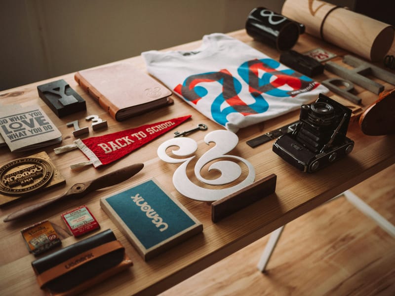
Incorporating retro imagery and icons into web design can instantly transport users to a different era. These visual elements can include:1. Vintage photographs or illustrations
2. Retro-style logos and badges
3. Old-school computer or technology icons
4. Pop culture references from specific decades
When using retro imagery, it's important to ensure that the chosen visuals align with the brand's message and target audience. Designers should also consider the quality and resolution of these images, especially when adapting them for modern high-resolution displays. Balancing retro visuals with contemporary design elements can create a unique and engaging aesthetic that appeals to users' sense of nostalgia while maintaining a modern feel.
Micro-interactions and Animations: Nostalgic Delights
Micro-interactions and animations can add a playful, nostalgic touch to web designs. These small, interactive elements can evoke memories of early digital experiences and add charm to modern interfaces. Examples include:1. Animated loading screens reminiscent of old operating systems
2. Retro-style progress bars or counters
3. Playful cursor effects inspired by early web designs
4. Sound effects that mimic vintage technology
When implementing these nostalgic micro-interactions, it's crucial to ensure they don't interfere with the overall user experience or slow down the website. The goal is to enhance the design with subtle, delightful touches that users will appreciate without feeling frustrated or distracted.
Balancing Nostalgia with Modern Usability
While incorporating nostalgic elements can create emotional connections with users, it's essential to balance these design choices with modern usability standards. Here are some tips for achieving this balance:1. Ensure responsive design for various devices and screen sizes
2. Maintain clear navigation and intuitive user interfaces
3. Optimize loading times and performance
4. Use accessibility best practices to ensure inclusivity
By carefully integrating nostalgic elements with contemporary design principles, designers can create websites that evoke positive emotions while still providing a smooth, efficient user experience. This balance is key to leveraging the power of nostalgia without sacrificing the functionality and usability that modern users expect.


