The Impact of Page Layout on Landing Page Conversions
The layout of a landing page plays a crucial role in determining its effectiveness in converting visitors into customers or leads. This article explores the impact of various layout choices on user behavior and conversion rates, providing valuable insights for businesses and marketers. By understanding how different elements and their arrangement influence user engagement and decision-making, you can optimize your landing pages for maximum impact. We'll delve into key layout components, discuss best practices, and offer practical tips to help you create high-converting landing pages that drive results for your business.Table of Contents:
The Importance of First Impressions
When it comes to landing pages, first impressions matter immensely. The initial layout a visitor sees can make or break their decision to stay and explore further. A well-designed layout should immediately convey the page's purpose and value proposition.Key elements to consider for a strong first impression include:
1. A clear, compelling headline
2. High-quality, relevant visuals
3. Concise, benefit-driven copy
4. A prominent call-to-action (CTA)
By strategically placing these elements above the fold, you can quickly capture visitors' attention and encourage them to engage with your content.
Do you need a website? Want to build a website but don't know where to start? Our website builder is the perfect solution. Easy to use, and with the ability to customize to fit your business needs, you can have a professional website in no time.
The F-Pattern and Z-Pattern Layouts
Understanding how users typically scan web pages can help you optimize your layout for better engagement. Two common reading patterns are the F-pattern and Z-pattern.The F-pattern is characterized by users scanning horizontally across the top of the page, then moving down and scanning horizontally again, creating an F-shape. This pattern works well for content-heavy pages.
The Z-pattern follows a zigzag path from top-left to bottom-right. This layout is effective for pages with fewer elements and a clear hierarchy. By aligning your key messages and CTAs along these patterns, you can guide users' attention and increase the likelihood of conversions.
The Power of White Space
White space, or negative space, is a crucial element in effective landing page design. It refers to the empty areas between elements on a page. Contrary to what some may think, white space is not wasted space – it's a powerful tool for improving readability and focusing attention.Benefits of using white space in your layout include:
1. Improved readability and comprehension
2. Enhanced visual hierarchy
3. Increased focus on key elements
4. A more professional and polished appearance
By strategically incorporating white space in your layout, you can create a cleaner, more inviting design that guides users towards your conversion goals.
Building a website with SITE123 is easy
The Role of Visual Hierarchy
Visual hierarchy is the arrangement and design of elements to show their order of importance. A well-structured visual hierarchy helps guide users through your content and towards your desired action.Key techniques for establishing visual hierarchy include:
1. Size and scale: Larger elements draw more attention
2. Color and contrast: Bold colors and high contrast stand out
3. Typography: Different fonts and styles create emphasis
4. Positioning: Elements higher on the page are seen as more important
By applying these principles to your landing page layout, you can effectively direct users' attention to your most important messages and CTAs, potentially increasing conversion rates.
Mobile-First Design Considerations
With the increasing prevalence of mobile browsing, it's crucial to consider how your landing page layout translates to smaller screens. A mobile-first approach ensures that your page is effective across all devices.Key considerations for mobile-friendly layouts include:
1. Simplified navigation
2. Touch-friendly buttons and forms
3. Vertically stacked content
4. Compressed images for faster loading
By prioritizing mobile usability in your layout design, you can provide a seamless experience for all users, potentially increasing conversions from mobile visitors.
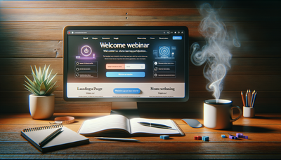
The Impact of Form Placement and Design
For many landing pages, form submissions are the primary conversion goal. The placement and design of your form can significantly impact its completion rate.Best practices for form layout include:
1. Placing the form above the fold for visibility
2. Using a single-column layout for easier completion
3. Minimizing the number of fields to reduce friction
4. Clearly labeling fields and using placeholder text
By optimizing your form layout, you can reduce abandonment rates and increase the likelihood of users completing the desired action.