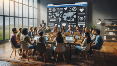
The Art of Microcopying: Enhancing UX Through Words
Microcopy, the art of crafting small yet impactful pieces of text in user interfaces, plays a crucial role in enhancing user experience and engagement. This article delves into the world of microcopy, exploring its significance in web design and digital products. We'll examine how seemingly minor elements like button text, form labels, and error messages can significantly influence user behavior and perception. By understanding the principles of effective microcopy and implementing best practices, designers and content creators can guide users more efficiently, reduce friction, and create more intuitive and enjoyable experiences. Join us as we uncover the power of words in shaping user interactions and learn practical techniques for mastering the art of microcopy.Table of Contents:
The Power of Microcopy in User Experience
Microcopy, often overlooked but immensely powerful, serves as the silent guide in user interfaces. These small snippets of text can make or break a user's experience, influencing decisions, providing clarity, and setting the tone for interactions. Effective microcopy can reduce user frustration, increase conversion rates, and foster a sense of trust and reliability.By carefully crafting every word, from navigation labels to error messages, designers can create a more intuitive and user-friendly environment. The right microcopy can transform a confusing interface into a seamless journey, guiding users effortlessly through complex processes and encouraging desired actions. In essence, microcopy acts as the voice of the interface, speaking directly to users and addressing their needs, questions, and concerns in real-time.
Do you need a website? Want to build a website but don't know where to start? Our website builder is the perfect solution. Easy to use, and with the ability to customize to fit your business needs, you can have a professional website in no time.
Crafting Clear and Actionable Button Text
Buttons are the primary drivers of user action in digital interfaces, making their microcopy critically important. Effective button text should be clear, concise, and action-oriented, leaving no doubt about what will happen when clicked. Instead of generic phrases like 'Submit' or 'Click Here', opt for specific and descriptive text that aligns with the user's goals.For example, 'Start Your Free Trial' is more compelling than 'Sign Up'. Similarly, 'Add to Cart' is clearer than 'Continue'. The key is to use verbs that clearly indicate the action and its outcome. Consider the user's perspective and choose words that resonate with their intentions. Additionally, creating a sense of urgency or highlighting benefits can increase click-through rates. For instance, 'Get Your Free Ebook Now' combines action, value, and urgency in a single, effective button text.
Designing User-Friendly Form Labels
Form labels play a crucial role in guiding users through data input processes. Clear, concise, and descriptive labels can significantly reduce user errors and frustration. When crafting form labels, aim for clarity and brevity. Use familiar terms and avoid jargon or technical language that might confuse users.Position labels consistently, either above or to the left of input fields, to create a predictable pattern. For complex fields, consider using placeholder text or helper text to provide additional context or examples. However, be cautious not to rely solely on placeholder text, as it disappears when users start typing. For required fields, clearly indicate this status using asterisks or explicit 'Required' labels. Remember, the goal is to make the form-filling process as smooth and intuitive as possible, reducing cognitive load and increasing completion rates.
Building a website with SITE123 is easy
Crafting Helpful Error Messages
Error messages are critical touchpoints in user experience, often occurring when users are already frustrated. Well-crafted error messages can turn potential negative experiences into opportunities for guidance and education. The key is to be clear, specific, and helpful. Instead of technical jargon or vague statements, explain what went wrong in simple terms and provide clear instructions on how to fix the issue.For example, rather than 'Error 404', use 'The page you're looking for can't be found. Please check the URL or return to the homepage'. When dealing with form errors, specify which fields need attention and why. For instance, 'Please enter a valid email address' is more helpful than 'Invalid input'. Additionally, maintain a friendly and empathetic tone to alleviate user frustration. Remember, the goal of an error message is not just to point out mistakes but to guide users towards successful completion of their tasks.
Microcopy for Navigation and Wayfinding
Effective navigation microcopy is crucial for helping users find their way around a website or application. Clear, descriptive, and consistent navigation labels can significantly improve user orientation and reduce bounce rates. When crafting navigation microcopy, prioritize clarity over cleverness. Use familiar terms that align with user expectations and clearly describe the content or functionality of each section.For example, 'About Us' is clearer than 'Our Story' for a company information page. Consider the user's journey and organize navigation items in a logical order. Use breadcrumbs with clear, concise labels to help users understand their current location and easily navigate back. For dropdown menus or mega menus, group related items together and use descriptive category labels. Remember, the goal is to create an intuitive navigation system that allows users to find what they need quickly and effortlessly.
Personalizing Microcopy for Enhanced Engagement
Personalization in microcopy can significantly enhance user engagement and create a more tailored experience. By addressing users directly and adapting content based on their behavior or preferences, you can create a more intimate and relevant interaction. Use pronouns like 'you' and 'your' to speak directly to the user. For example, 'Your account' feels more personal than 'Account'.Leverage user data to customize microcopy where appropriate. For instance, greeting a returning user by name or referencing their previous actions can create a sense of continuity and recognition. However, be mindful of privacy concerns and avoid being overly familiar or intrusive. The key is to strike a balance between personalization and respect for user boundaries. Remember, the goal of personalized microcopy is to make users feel understood and valued, enhancing their overall experience with your digital product.